Log in & Registration
a Case Study
UX & UI DesignClient: DoccleLocation: Leuven, BelgiumDate: November 2020TLDR: See pdf for shorter version
Overview
Doccle is Belgium’s biggest administration platform (2020). The principle is simple: create a free account or log in to add companies from which you want to receive your documents. Off to a paperless and easy administration!
Users & Audience
The people that use Doccle, or Docclers as we call them, are between 18 to 65+ years old and need to be residents in Belgium.
Problem
At Doccle, login questions have always been number one for our Customer Support Team. Everyday 40% to 50% of all user questions are login-related, such as:
“How can I log in?”
“I forgot my password.”
“What’s the difference between a username and password?”
“I have no documents on my account.”
With some research, we were able to understand that these questions weren’t only related to the Login flow itself, but also the Create Account one.
Roles & Responsibilities
Being the only designer, I worked end to end on this project as a UX and UI Designer and helped with the testing. This project involved the Customer Support Team, the Product Owner of our web app and the best development team ♥️
Scope & Constraints
Space on the roadmap was short. So this needed to be more refactoring of the UI type of project than a UX improvement one. But thanks to the greatest development team and the help of a great Product Owner, we were able to do both, in a way.
During this project, we started to create our Design System and being responsive started to be mandatory instead of nice to have.
By design, upon registration, Doccle asks for a username as a way to identify users. There are situations when the email address is used as a username, which is good (but not great), but that’s not always the case. In the future, we want to change this but for now, it’s something that we need to work with.
Process
For a year the Customer Support Team would ask our Docclers for some behaviours hints, to understand how they were using the login and registration page. This is something that we still do today, applied to all issues. This helps a lot in understanding user behaviour while our user testing process is not very mature.
Problems found:
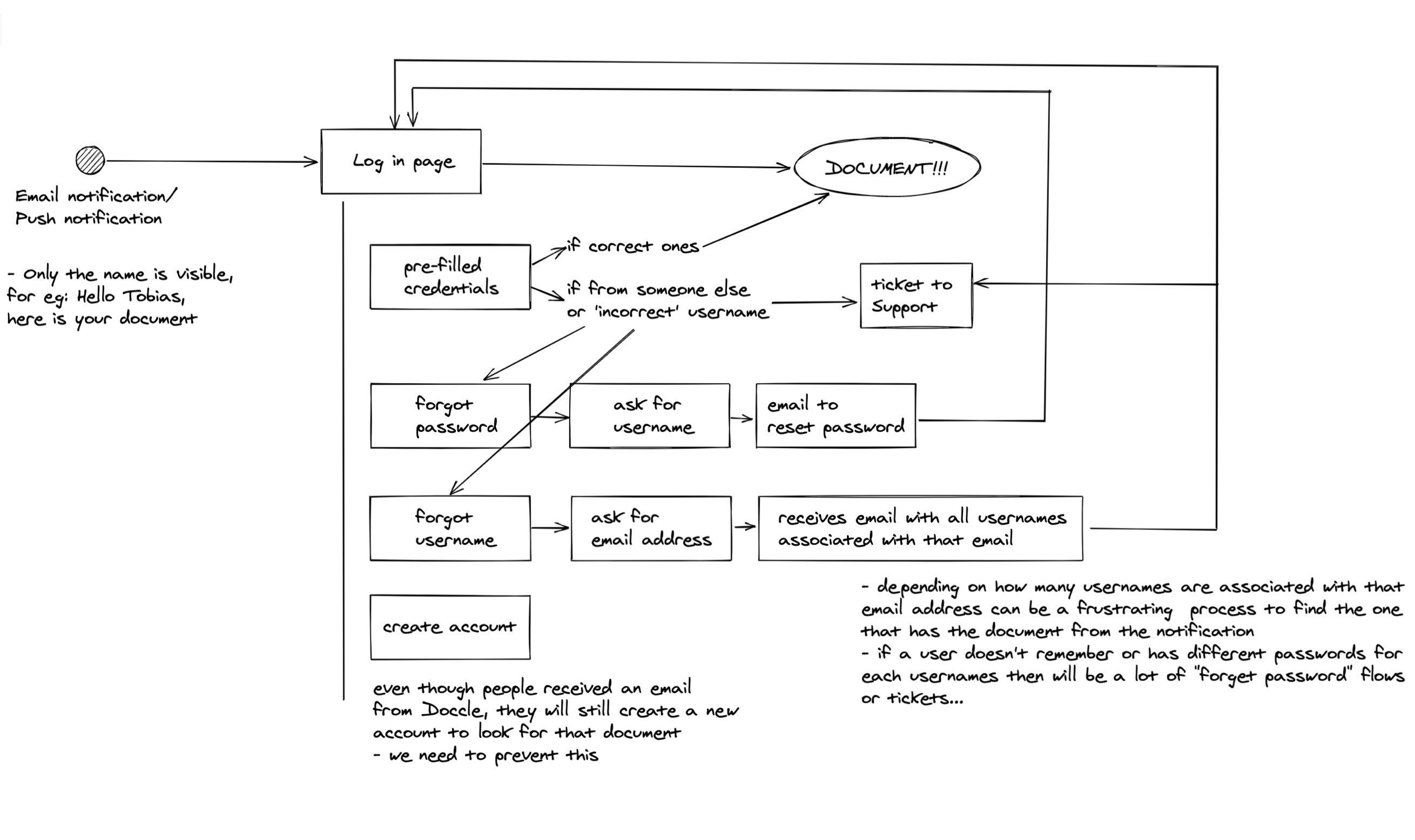
All the possibilities that can occur between a new document notification to the actual visualisation of a document
• Most of our Docclers only go to Doccle when they get an email or push notification telling them that there’s a new document waiting for them. This can be a monthly invoice or a yearly tax document. So it’s only natural that some people don’t remember their passwords or even if they already have an account on the platform or not.
• Together with the fact that at the moment we identify users by username and not email address, this led to some unwanted double-accounts. For example, some Docclers would create an account to receive their taxes, and another for their telco invoice, same email but different usernames. So, by the time they need to log in, coming from their email or push notification, they will only see or their taxes or their telco invoices, depending on which username they log in with. Naturally, this is a very frustrating situation to be in. Our users can easily become lost and confused because even though they just received an email indicating a new document is available, they don’t see it on their account or even on their new account accidentally created. The conclusion is easily drawn as “something is wrong with the platform” which normally generates a complaint. As you can imagine this is the type of issue that takes some time for Customer Service to pinpoint the real root of the problem.
• Another recurrent issue was autofill credentials. This sometimes led to confusion on shared family computers because it makes it easier to log in to the wrong accounts.
• For less tech-savvy Docclers more guidance was needed on the login process as well.
Problems to solve:
• Avoid the creation of a second unwanted Doccle account.
• Prevent autofill of credentials when first arriving at the login page
• Find a better way of guiding our Docclers during the Login and Create Account flows
Log in
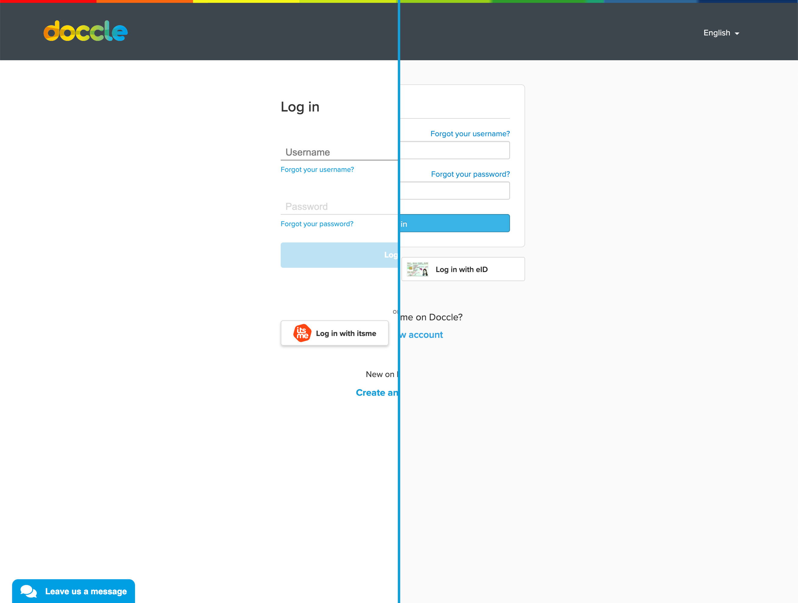
New & Old
What changed and why:
Overall there’s more white space in between elements, which makes the information easier to process and digest. The input fields are bigger in height, 44px that are maintained in all breakpoints, which makes them more accessible to all screen sizes. Changing the background to white and increasing the font size also gave the page a more modern look and spacious feel.
The actions “Forgot username” & “Forgot Password” have now a more common placement. This is very important because we want our Docclers to feel at ease with the platform and having UI elements in predictable places is the beginning of a great experience.
The interaction with the login also changed. Disabling the password input field and the Call To Action made it obvious that first, we need a username and then a password. As soon as people start typing the next element gets enabled and your password manager also works.
What did we solve?
With this solution, we believed that our Docclers would have more guidance on the login process and the autofill issue was also fixed. Making people choose the actual useful information that they would like to use to login to Doccle.
Final implementation on mobile
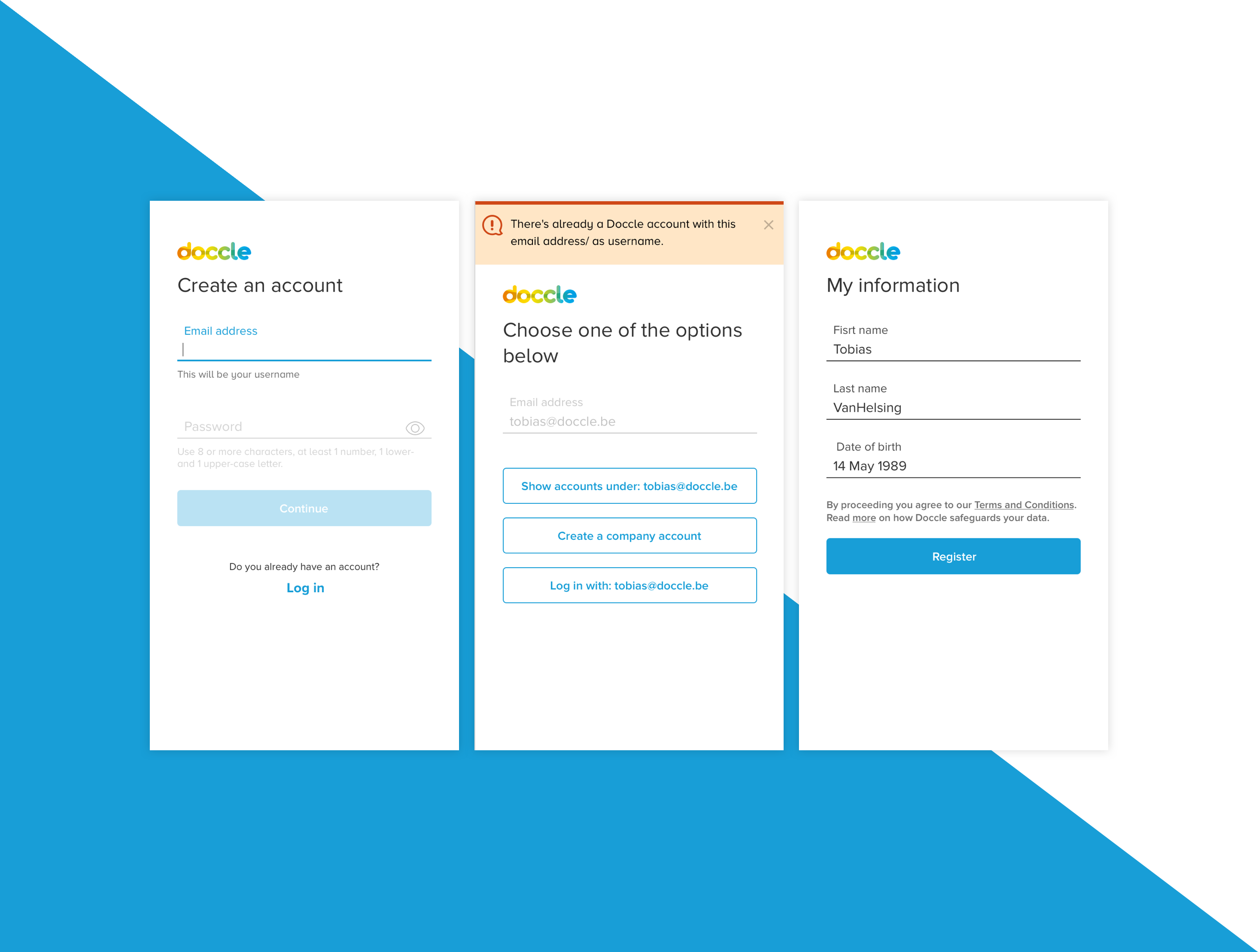
Create an account
Here the biggest change was the flow.
This is how it looked like before:
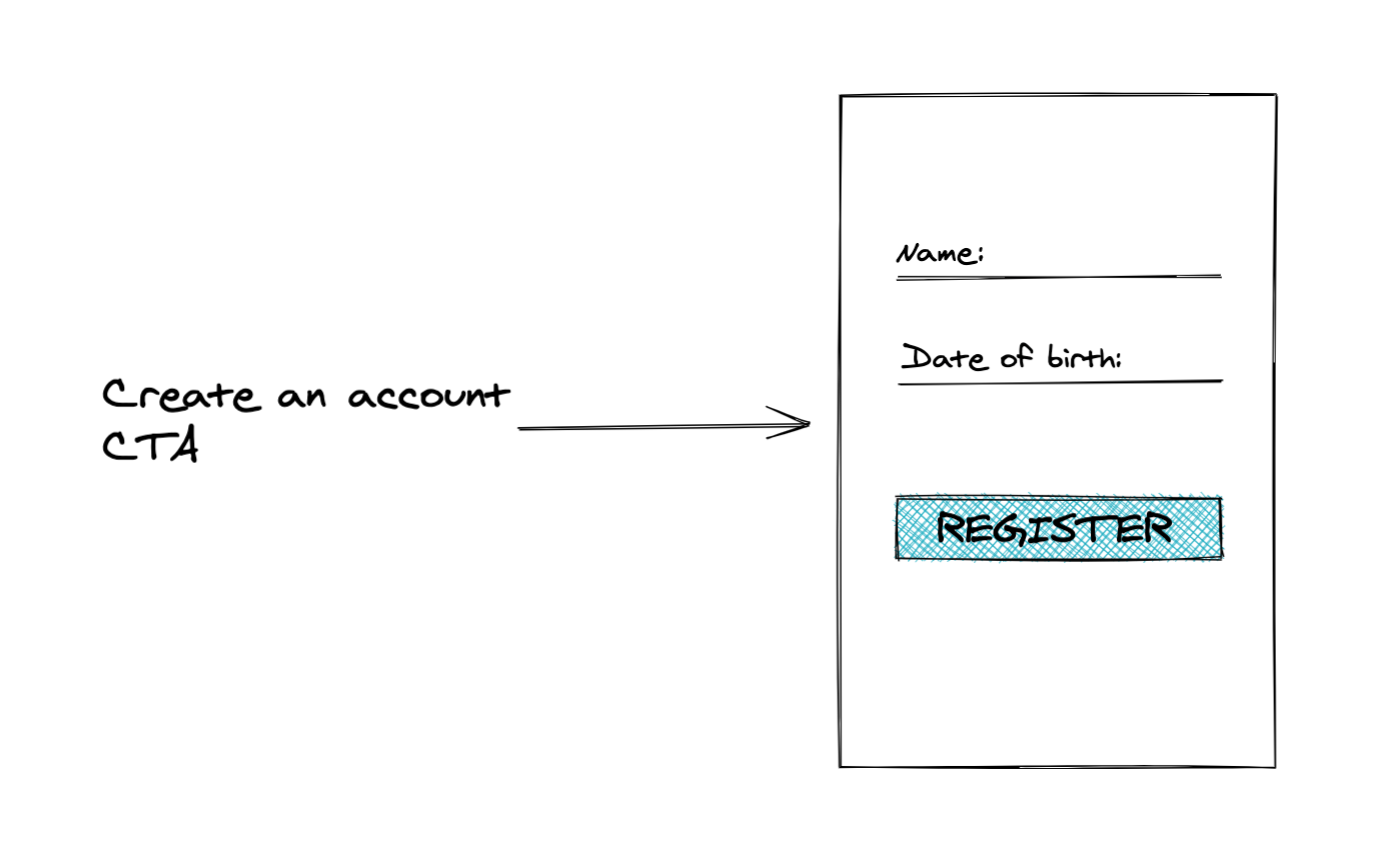
It lookes straight forward...
And this is how it ended up to be:
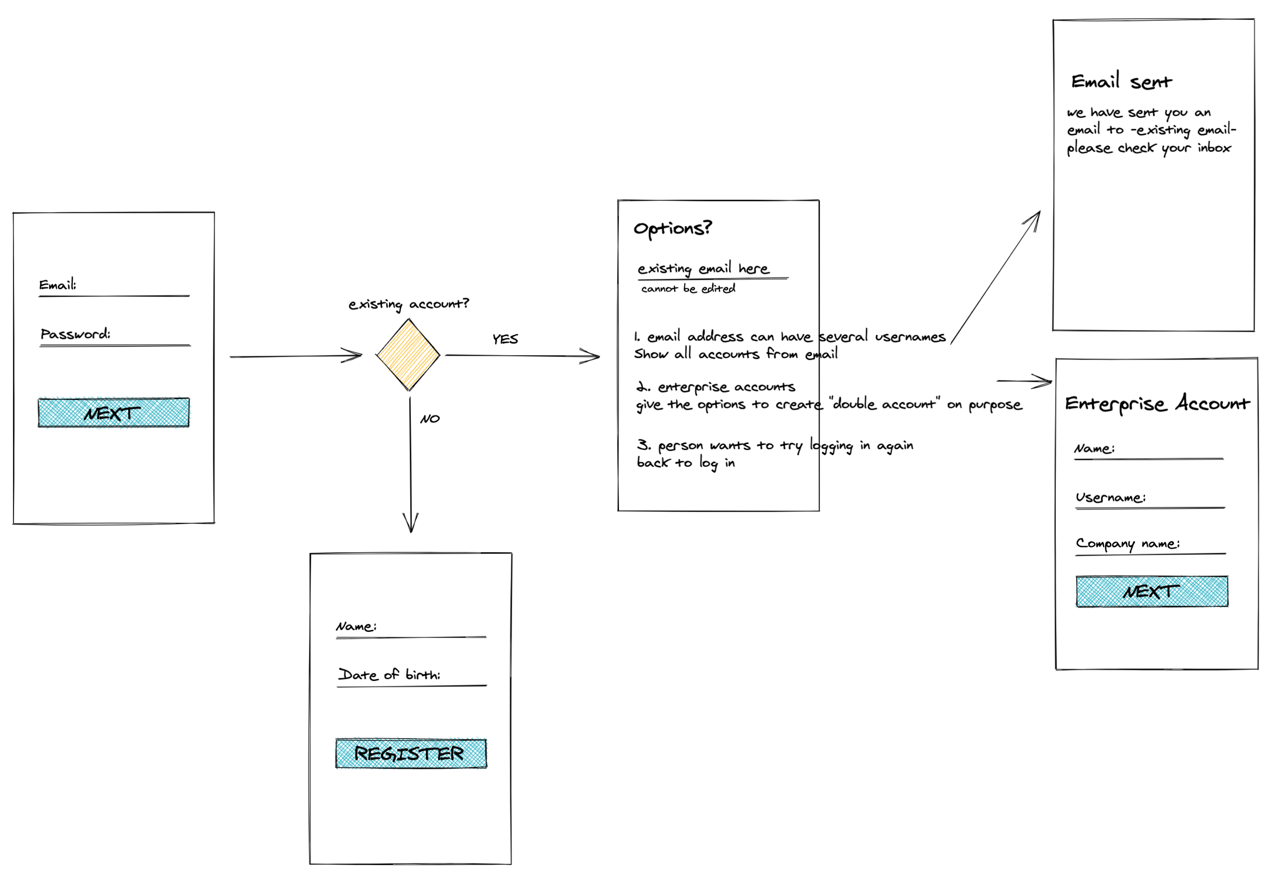
Looks too complex, but it's not 🙂
What we did was separate the flow into steps, each step then becoming a separate screen, this allows us to make validations along the way that prevent double accounts.
What changed and why:
In the first screen, we can validate if the email address or username (not the same right now) is already in use. If yes we provide three options to Docclers:
• Show existing accounts under the submitted email address
◊ By choosing this option the Doccler will be able to see all the usernames associated with that email address.
• Create a company account
◊ For our enterprise Docclers
• Log in
◊ In case the person wants to try again since now they know that there’s an account. Maybe they just forgot their password!
If the email address is not in use, the Account Creation flow continues as is.
What did we solve?
With this, we solved the double accounts created by accident. Now even if our Docclers only visit the platform sporadically we can guide them in a better way and our Customer Support Team has less work to identify their questions.
Some steps from the Account Creation flow
Outcomes & Lessons learned
These changes went live on the 2nd of November, 2020. By the 24th we added a hot-fix to the roadmap.
What went wrong?
Each day the Customer Support Team had at least one Doccler complaining about not being able to immediately click log in because the credentials were not pre-filled.
The tickets generated by the accidental autofill were less frequent than the ones generated by the lack of it. This helped put things into perspective, now we know that the number of people unhappy is residual compared to the amount of silent happy Docclers.
This is something that I will use to explain the importance of user testing to the company. We are not very mature, yet, in this regard but I believe this is a good example of how data influences decisions and how we could have avoided the extra development time by looking at the numbers.