Error Pages
that reduce Customer Service time
UX Research, Illustration, UI DesignClient: Vente-ExclusiveLocation: Brussels, BelgiumDate: 2018
Overview
Vente-Exclusive (VEX/ Veepee), now rebranded to Vepee, is an e-commerce website mostly known by this name in Benelux and France.
Vente-Exclusive is a discount e-commerce website. Sales open for a limited time and you have to create an account to enter the web-shop.
Problem
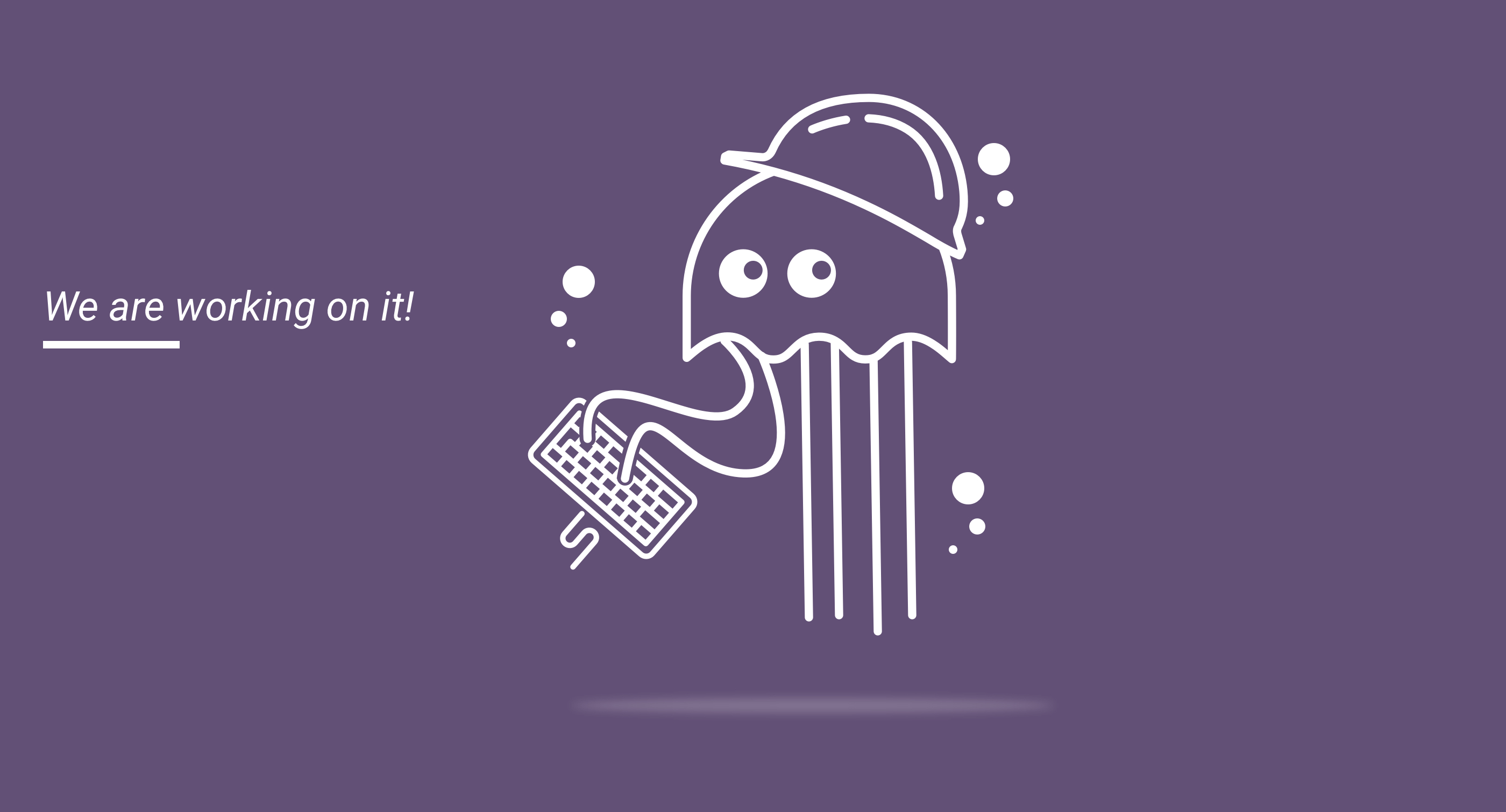
When I joined the team at VEX there were no customized error pages, which was surprising at the time.
404 pages, error pages, empty states are usually a very overlooked aspect of the user experience, but they help the user to know what’s happening, why it’s happening and, when applicable, what’s possible to do about it.
Analytics showed us that customers were mainly buying in the morning, during breakfast and after dinner.
With such short windows of time, you can imagine the frustration of the customers not being able to buy a product during a sale or just get frustrated and leave. Naturally, the first option meant that our support team was flooded with messages right away.
So the goal of this exercise was to reduce those angry calls by keeping users and work colleagues happy 😊
Users & Audience
According to company research, VEX users were mainly middle to high-class working moms buying products for the entire family. But our young adult audience was starting to show some growth as well.
Roles & Responsibilities
On this project, I worked on the creation of the characters and as a UX and UI designer. I was part of the IT team but I mainly worked together with the marketing department for this.
Marketing was responsible for monetary campaigns, communications, advertising for more than 4 countries, so there was no better department for feedback and understanding of the audience I was working for.
Scope & Constraints
I joined the company at the beginning of a major rebranding but all the big decisions regarding brand guidelines had already been made.
Working with a predefined brand identity was a bit of challenge accessibility wise, but still, the goal was to have a final product that would allow equal access and capabilities to everyone.
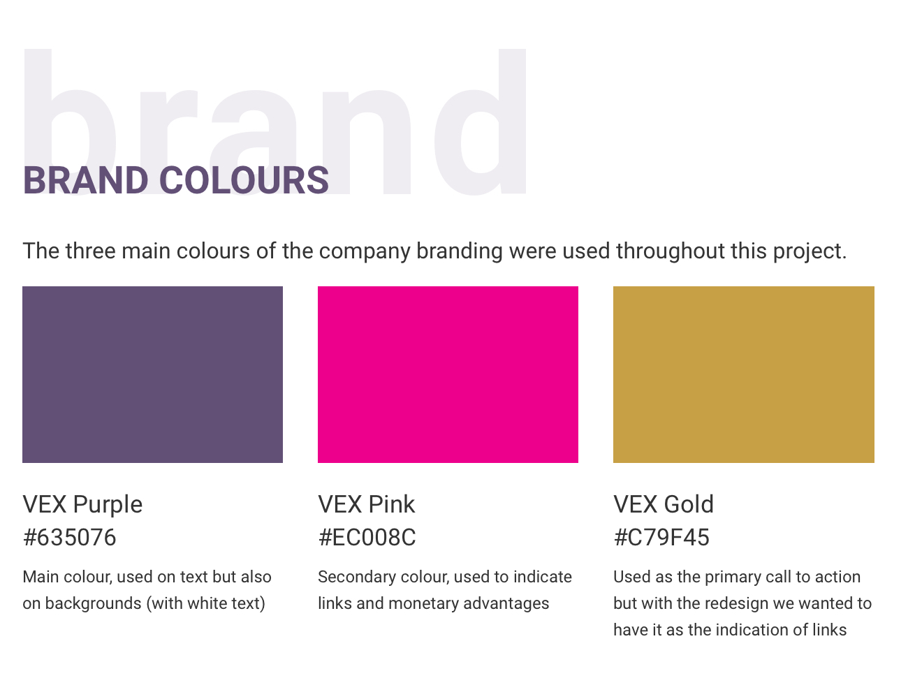
brand colours
High-level process
Since I was helping out the Marketing department as a web and second graphic designer one-day per week, I knew they had some initiatives going on to increase our young adult audience. Here I saw an opportunity for a great collaboration between departments because I wanted our users to engage with the error messages. The goal was to not lose users during these errors since we knew they were often solved very quickly. So I wanted to have some sort of engaging activity to keep them on the website until the page would refresh allowing them to go back to browsing the webshop.
We decided to tackle the error messages with positivity and clear sentences in order to provide the context of the error to the user on a more customized experience.
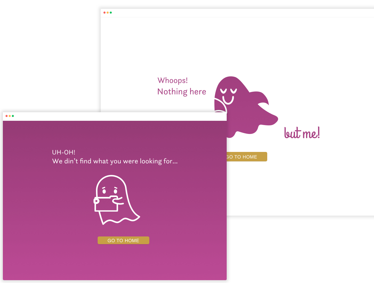
404
We tried to create fun engaging characters and activities, origami in these examples, to try to reduce stress and switch the focus from the errors. Whenever applicable we always provided navigational hints to avoid users feeling lost or frustrated.
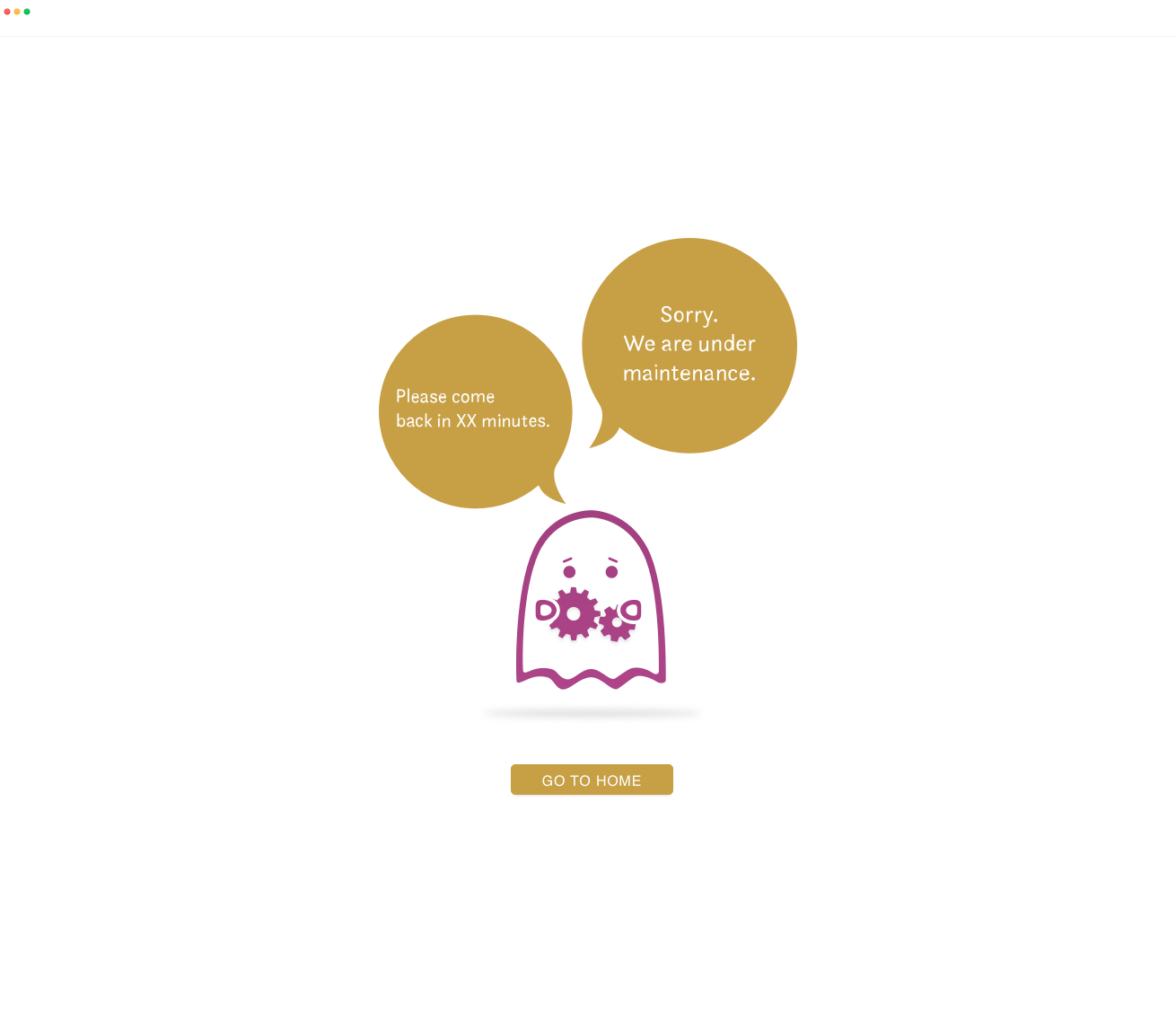
maintenance
Empty states and error pages can be used to amplify business opportunities, so that’s what we did by promoting the company’s Instagram page through a #hashtag. 💪 This was very important for the marketing team because, at the time, VEX was starting to create a presence on social media making any extra influx of traffic more than welcome...
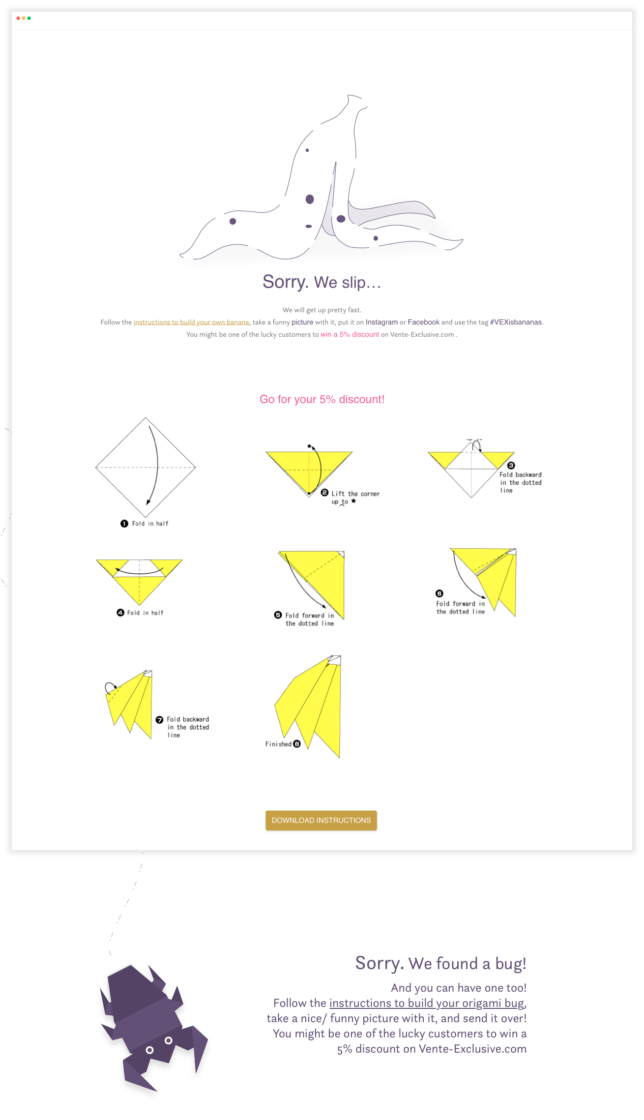
bugs...
Outcomes & Lessons learned
I believe we were able to find an illustration style that worked when filled in as well as when white outlined on top of background colour.
Most importantly, I believe we were able to add personality and surprise, maybe even delight 🙈 to a dark corner of this e-commerce platform.
However, due to a major restructuring in the parent company, in the end, the project was cancelled…
But please, on your next project, or even on your current one, don’t lose the opportunity to enhance the user experience and make someone smile 😊