Redesigning
for accessibility
UX Research, UX &UI DesignClient: DoccleLocation: Leuven, BelgiumDate: December 2019 - February 2020TLDR: See pdf for shorter version
Overview
What's Doccle?
Doccle is Belgium’s biggest administration platform (2020). The principle is simple: create a free account or log in to add companies from which you want to receive your documents. Off to a paperless and easy administration!
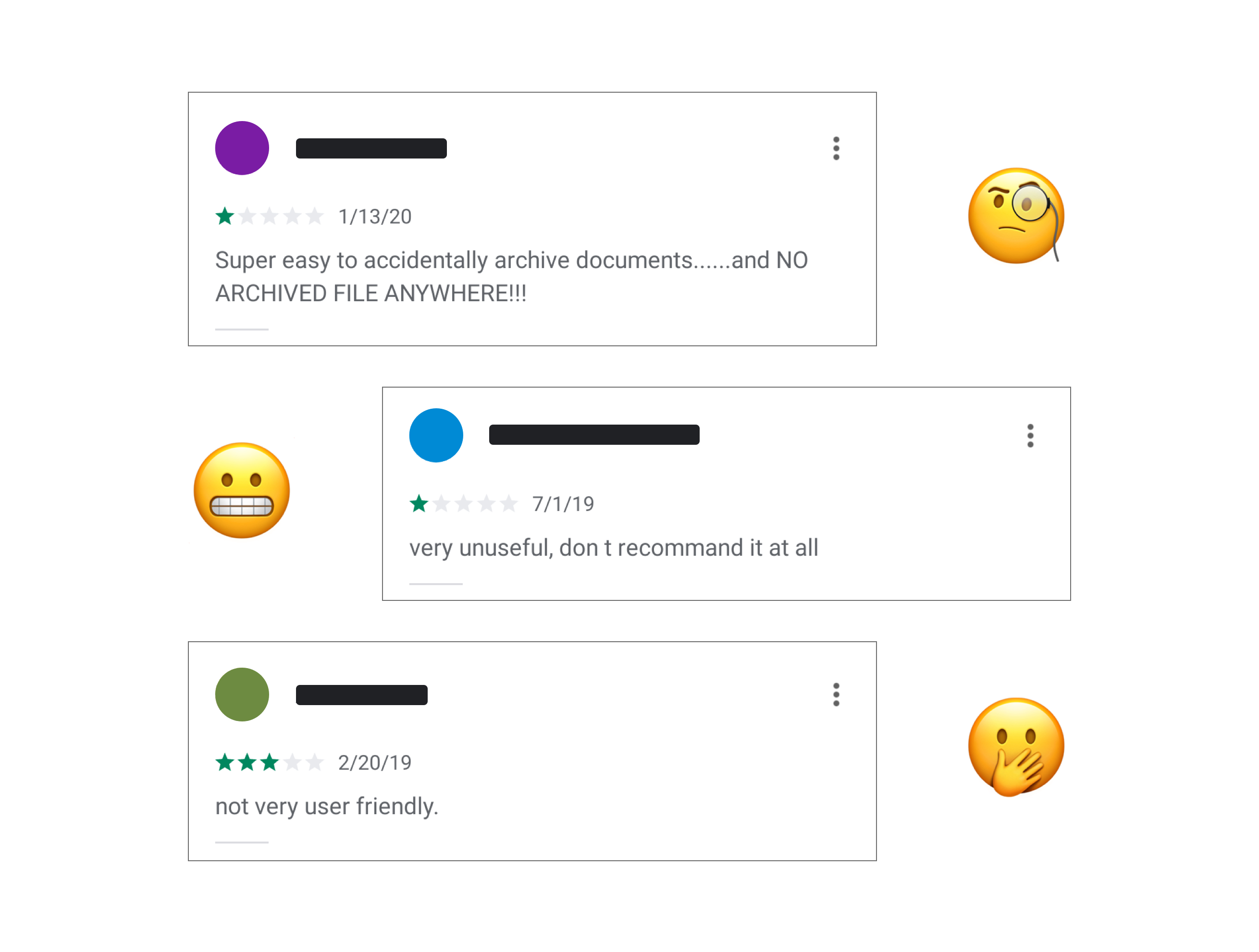
When I first downloaded the Doccle app, for my job interview, I had some issues finding my way around it. Considering myself a tech-savvy person I found this very unsettling so I went to read the user reviews on Google Play Store and the App Store. The low ratings had a common theme: not user-friendly, very unusable, complex app, …
Let’s do this 💪
Problem
At Doccle we were all aware of a much-needed enhancement of UI and UX on our (mobile) apps. Besides, user feedback stated that Doccle wasn’t very easy to understand and only our expert users could find their way within the app. A big concern was also the accessibility of the app especially regarding the colour contrast, clickable areas and screen-readers. This needed to change since Doccle is meant to help everyone, regardless of context, ability, or situation.
Users & Audience
The people that use Doccle, or Docclers as we call them, have between 18 to 65+ years old and need to be residents in Belgium. Doccle needs to be straightforward, intuitive and easy to navigate for the tech-savvy Docclers but also the not so techy. It’s a challenge to find a solution that suits all as the needs of information, guidance and context are distinct.
Roles & Responsibilities
Being the only designer, I worked end to end on this project. From user feedback, accessibility research, UX flows, UI, helped during implementation and of course testing before sending it out to production. For the implementation phase, I worked with two external developers (Android and iOS) that have been collaborating with Doccle for some time, mostly remote. We also had a Product Owner that also tested the app later on.
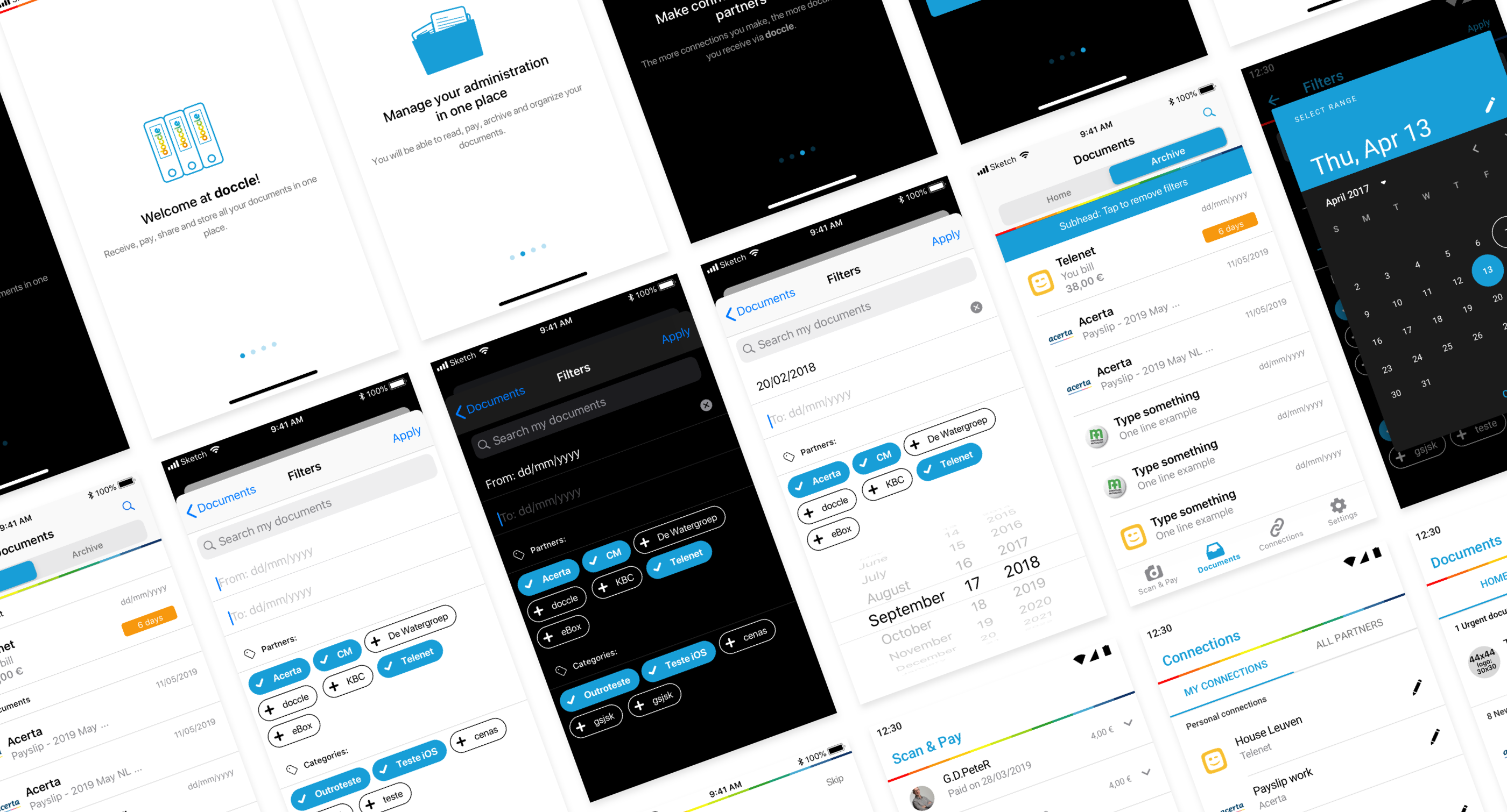
The final result of the Filters screen for iOS 13, light and dark mode
Scope & Constraints
The initial goal of this project was just to be dark mode compatible on the iOS app due to some restrictions from Apple.
To help convince the stakeholders to broaden the scope I came up with a detailed plan, with the help of the dev team, and a roadmap proposal. The goal was to show them that we needed to take this as an opportunity to improve both mobile apps because we won’t get that chance any time soon.
The plan showed that, since there was a lot of legacy code, whose complexity and lack of documentation would largely increase the implementation time, we could go for a more native look & feel while removing and improving some existing flows. This will not only help the users’ navigation but also make life easier for our developers and, later on, testers.
Comparison between the previous and newer design of the categories screen for iOS
This project took around 3 months. It was a hard deadline since other features had more priority on the roadmap. Therefore, a close collaboration with the development team was crucial to make sure we could tackle the improvements that would fit our time-frame while already preparing the way for the most time-consuming enhancements down the line.
Developing for Android is a challenge. Most of this challenge comes from the multitude of Android versions still running on devices worldwide. In this specific project, for example, we are aiming for the current Android version, which is 10, but we still need to support Android 5 because a lot of Doccle users still run on it. This creates limitations for me as a designer, but also for the Android developer. Therefore we had many iterations to figure out how to deliver a good solution. In this case, to define a good solution would mean to still carry the Doccle-feeling and good user experience. As for older Android versions we were aiming to keep having a quick feeling app without compromising much on the features and look & feel.
High-level process
My notes on everything I wanted to tackle during this project
Some details
Doccle blue
Previously the Doccle app had a different colour for each menu, which represented a huge challenge for our accessibility first approach. First things first! We needed to understand if these different colours were relevant to our Docclers’ navigation. According to the support team, and from the reviews from App and Play stores, we were able to understand that the users were always referring to the screen they were on by its title and not by its accent colour.
Each screen had its main colour, making it difficult to maintain and increased the testing effort.
We then decided to go for one main colour on the Doccle mobile application.
Blue was already a very much used colour on the Doccle web app as well as on email communications and social media posts. So the challenge was only to find a similar tone that would fit light and dark mode in terms of readability and colour contrast. And "Doccle-blue" was born! By doing this, we manage to keep the visual impact on our Docclers to the minimum while unifying our user experience across our different platforms.
Final look & feel of some empty states with Doccle Blue working for light and dark mode.
Top bar - Branding perspective
This was a tough one since a lot of our stakeholders considered the dark grey top bar to have a Doccle feeling and part of the branding style.
It took quite some iterations on this but, in the end, everyone was happy with a light top bar for light mode and a dark top bar for dark mode as long as we managed to keep the rainbow present.
The rainbow is a very important element of Doccle branding since the beginning of the company. It’s present across all our communications, internal and external and it’s also part of the company logo.
Previous top bar design for the Documents screen
Top bar - Functionality
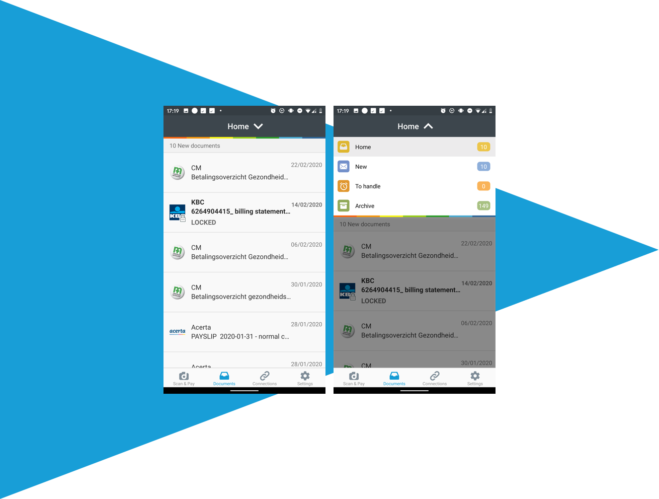
“Not finding the Archive page” was one of the main reasons for bad ratings on the App and Play stores. The solution was to change the dropdown into two tabs: Home and Archive. Under Archive, Docclers can find all their documents, sorted by date (just like before), while on (new) Home there’s a first section with Urgent documents meaning documents that require any action from users like pay or e-sign. Followed by the New documents section, where all newer documents are grouped and ordered by received date. After 2 months these documents are only available under the Archive tab. Finally, To handle is the last section under Home.
This enabled us to have all options visible, as sections, instead of options under a dropdown.This made it easier for our Docclers to find all their documents by just scrolling.
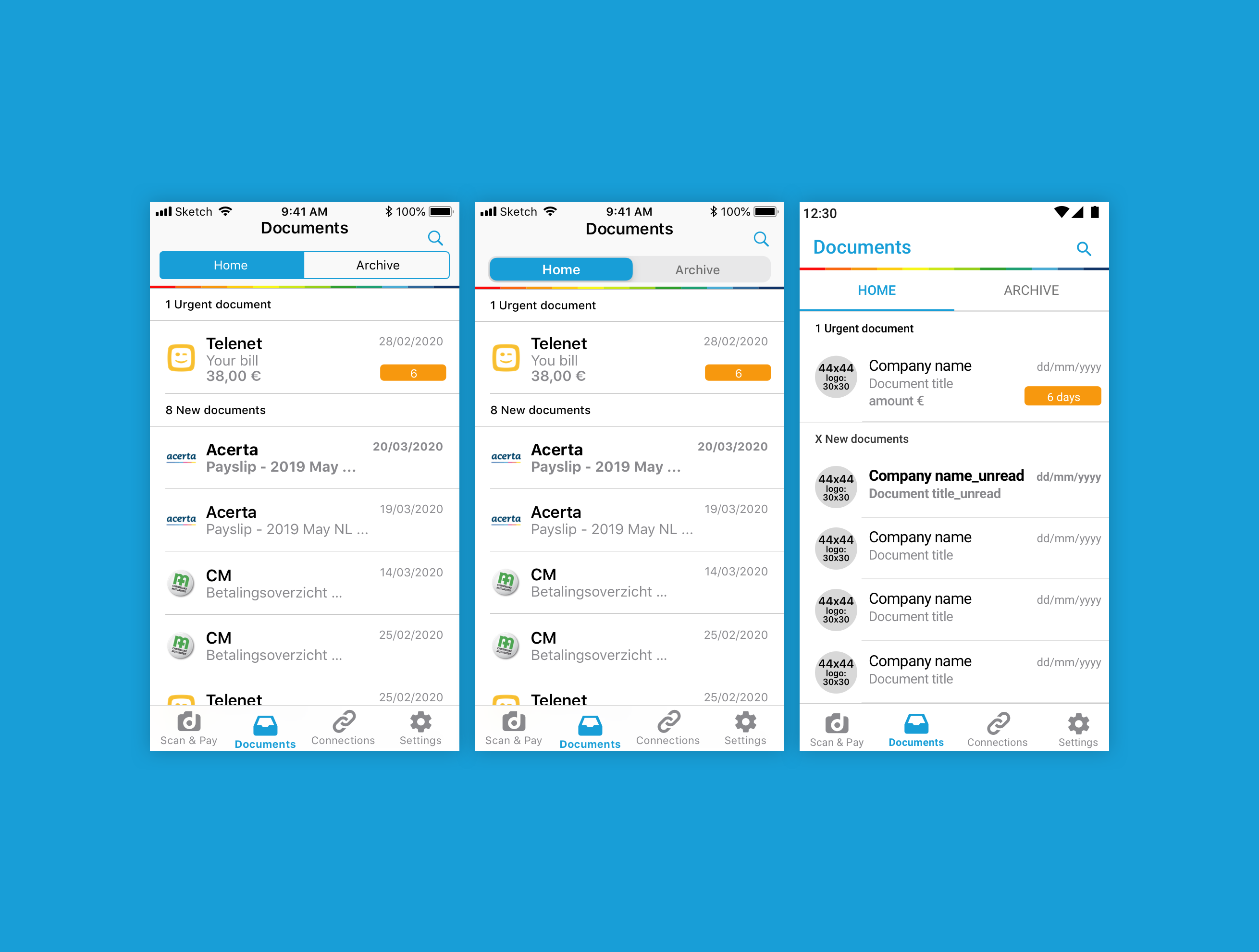
Current top bar design for the Documents screen.
iOS 12, iOS 13 and Android
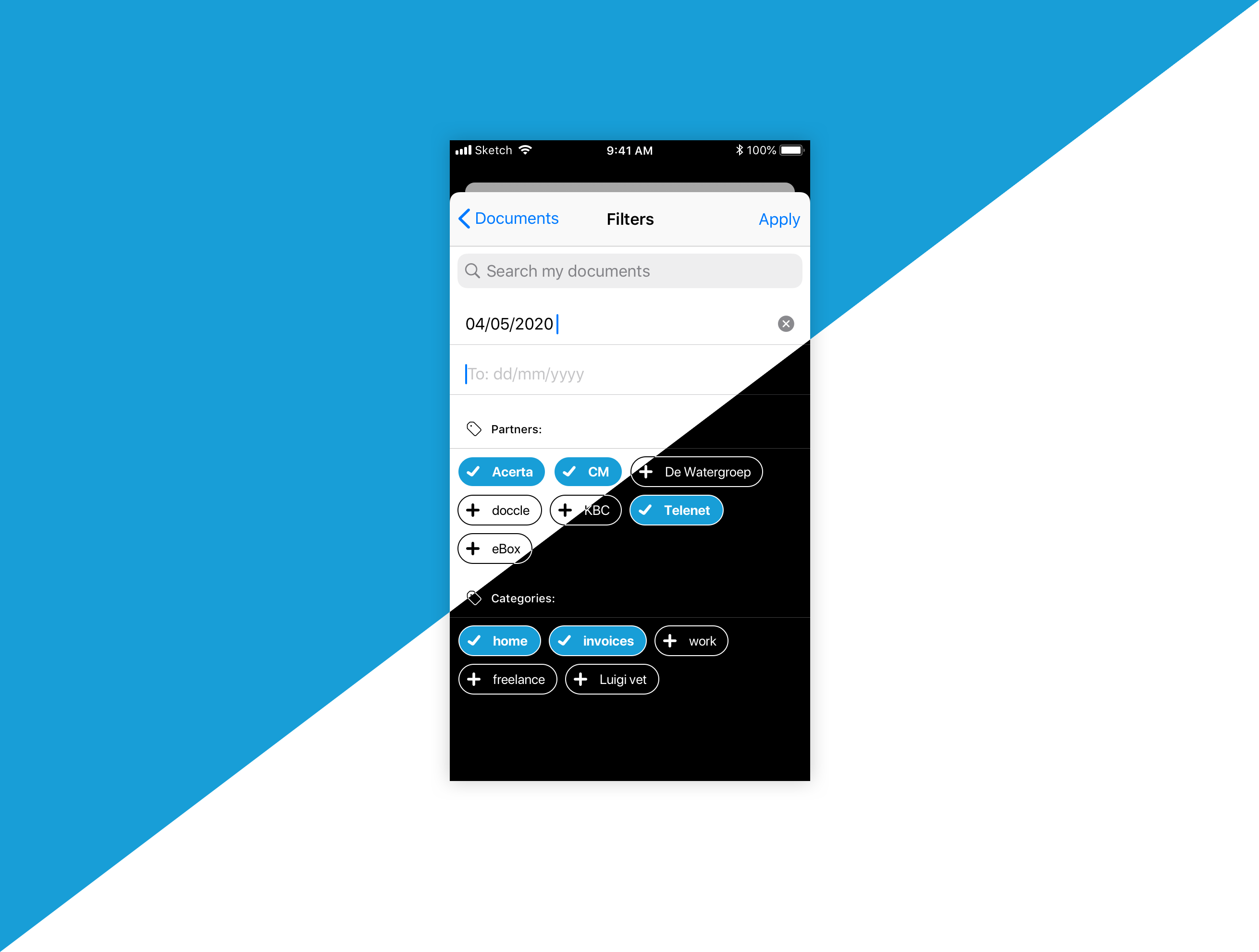
Filters
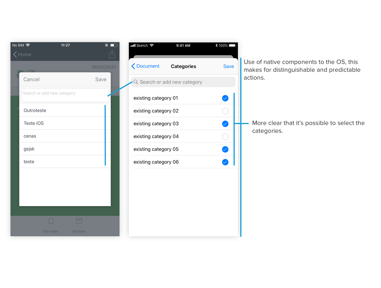
The major improvement on the Filters screen was the redesign of the categories. The flow of the screen was also improved, by having the search input followed by the date range input and only then by the categories. This section is composed of a Partners section, which is populated with all the companies that the user is connected with. Next, at the Categories section, we find the categories created by our Docclers.
Previously, when a tag was selected, you could barely notice the difference, even if you are not a visually impaired person. To avoid this the categories have now icons before the labels that change depending on their select state. So now everyone can understand the difference between the two states, regardless of vision, device screen and tech-savviness. We also reduced the click error by making the categories bigger, in height and width.
There’s much work still to be done around categories, but for now, this is the result 😊
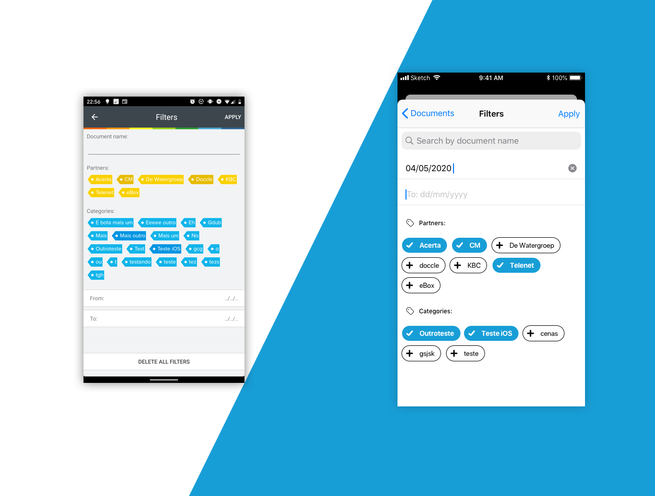
Filters screens
Introduction cards
The introduction cards are meant to give a first general overview of what is Doccle and what you can do on the app. The illustrations were re-thought for a more accurate explanation of the Doccle features and to get a more simple and modern look & feel. The use of the entire screen is to get users more focused on the explanation than on the dimmed background.
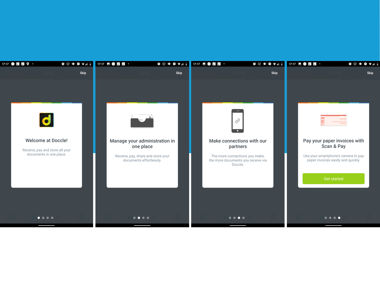
Previous version of the introduction cards
Our goal is to re-think the users’ onboarding, making it more informative and interactive. But for now...this is where we stand.
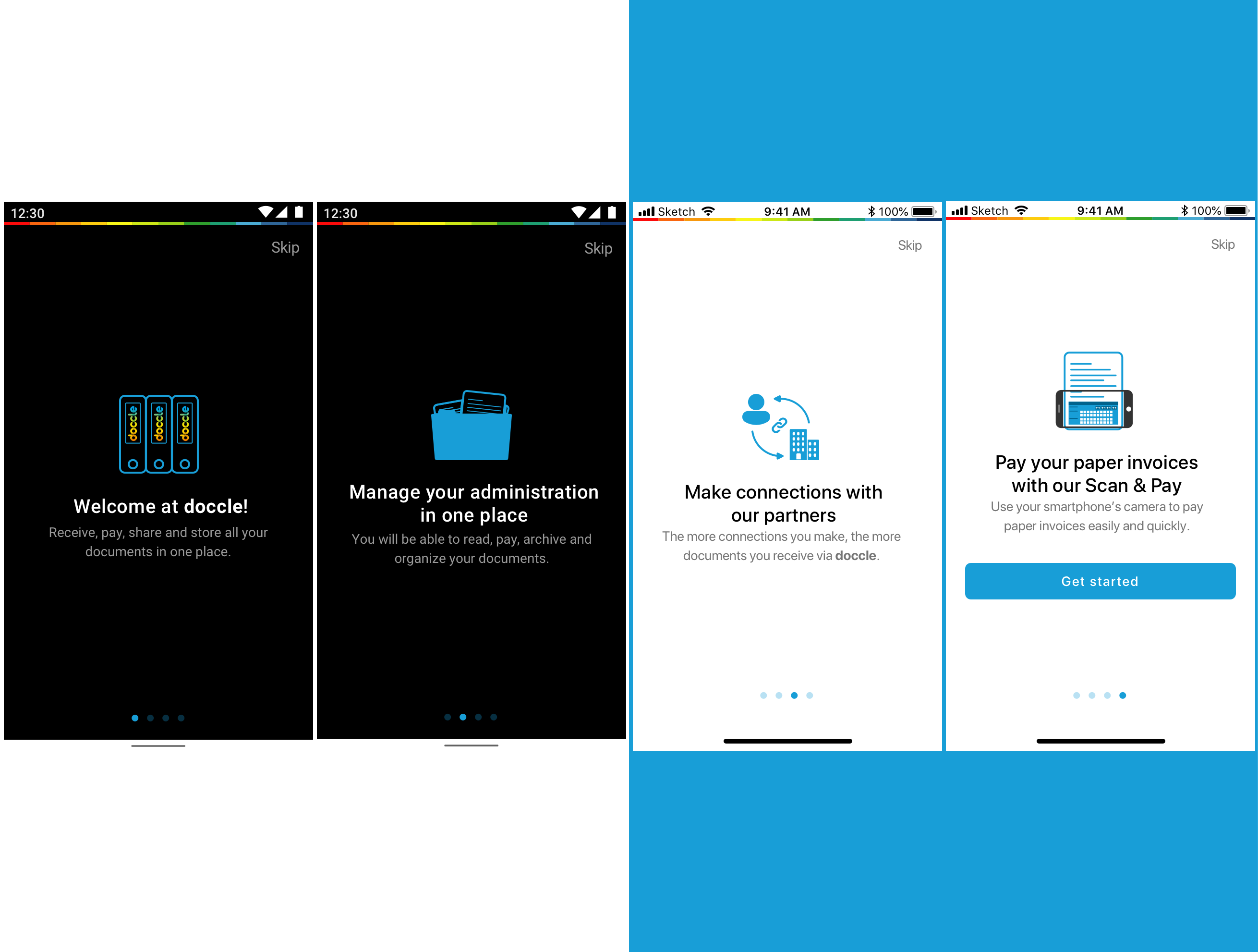
New version of the introduction cards | 2x Android & 2x iOS
Small changes, big impact
Previously the interface was the same for iOS and Android, so, by changing to a more native look & feel we’ve reduced the learning curve and helped Docclers feeling more confident to explore and use the Doccle mobile app. By using native components we were also able to reduce implementation time and code maintenance. The headers and dropdown lists now have a more common feel for each OS and the background was changed from light grey to white, giving the app a more modern and light look.
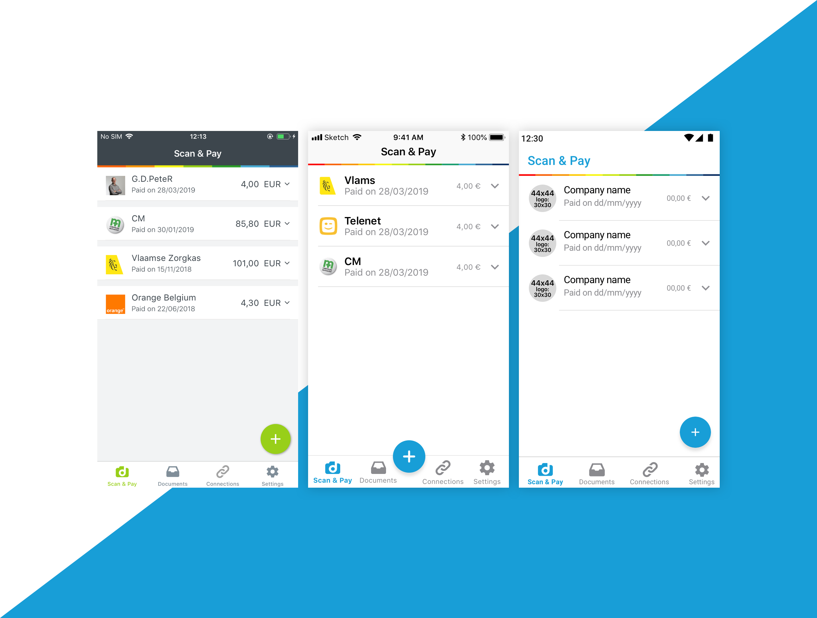
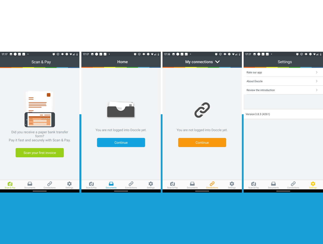
Difference between Scan & Pay screens, previous design, iOS and Android design
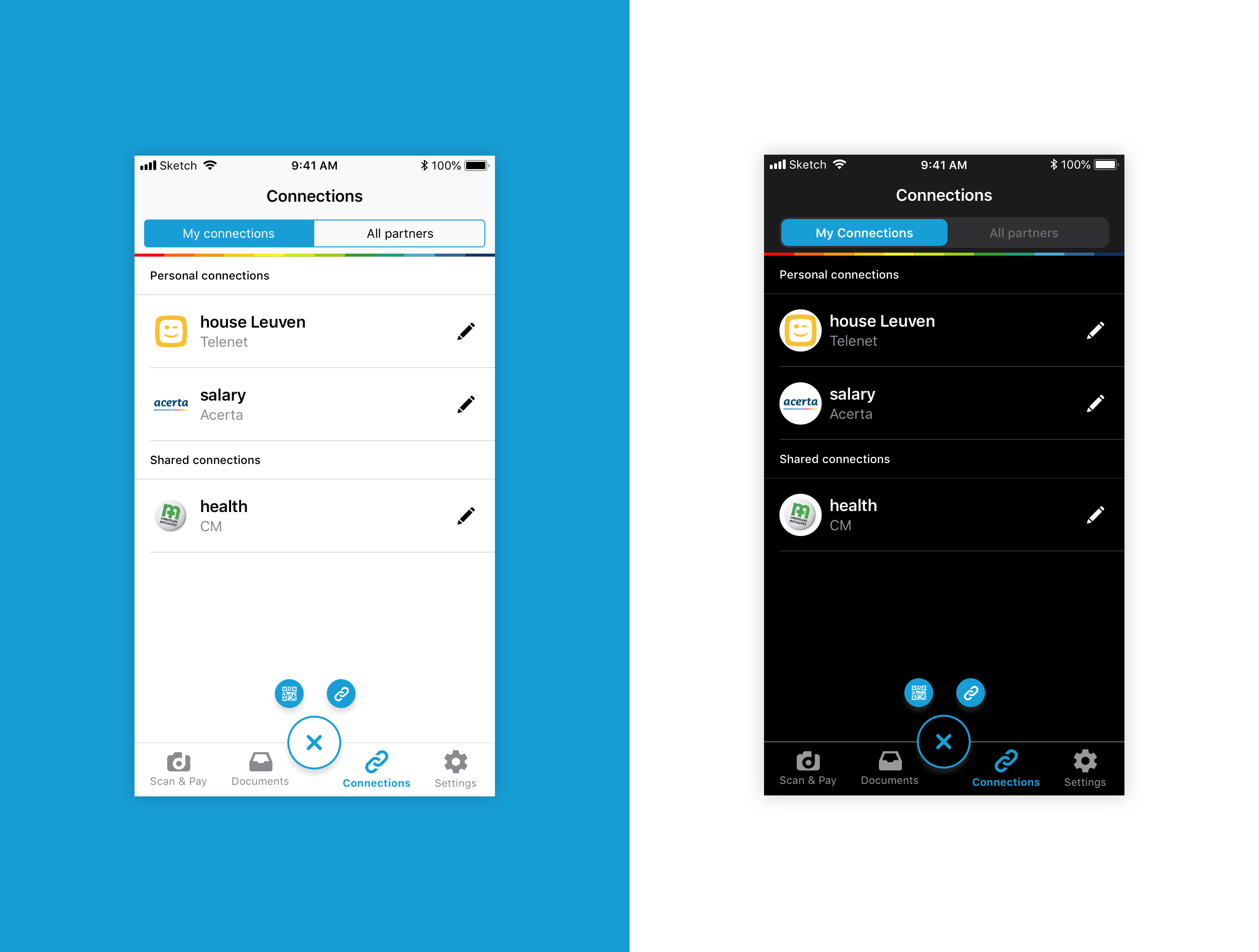
Redesign of the Connections screen for iOS 12 (on the left) and for iOS 13 (on the right)
Outcomes & Lessons learned
I believe that an accessibility approach makes an app better for everyone and should be something that you do from the beginning. At the end of this project, we managed to have both apps more accessible and, thanks to the use of native components, we reduced the cognitive weight from our Docclers when using them.
There’s a lot of work still to be done, we need to keep on improving but I’m proud of this project because it was the front door to a more accessible and inclusive approach to the Doccle brand.
We have been making these changes to our web app and implementing them on our (in construction) Pattern Library so that all of our applications can be more accessible.
The feedback from Docclers has been great, and our ratings on the apps’ stores have been going up.