Creating the visual identity
of a chatbot
UX Research, Characer Design, Visual DesignClient: DoccleLocation: Leuven, BelgiumDate: December 2018 - February 2019
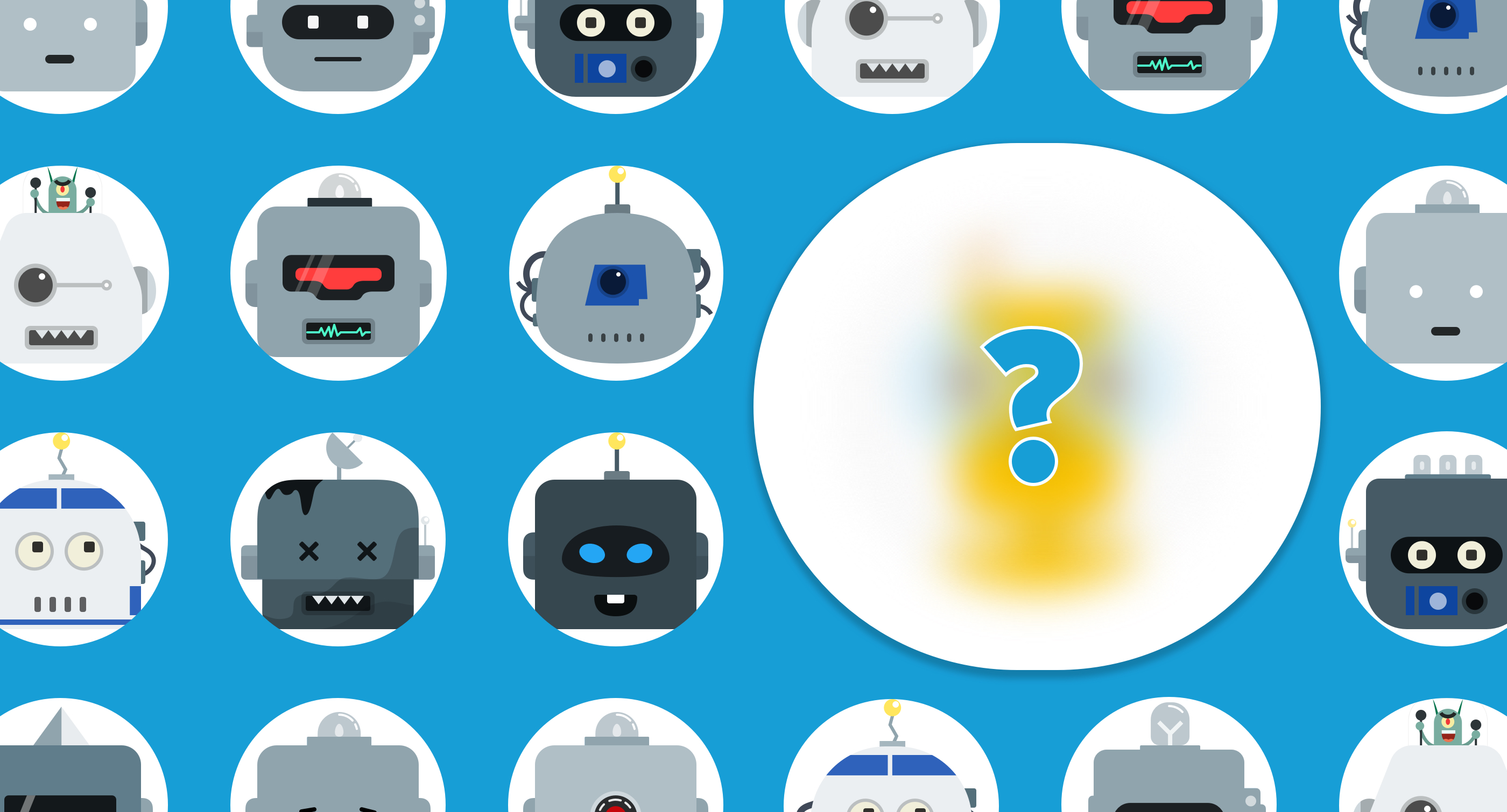
Overview
Doccle is Belgium’s biggest administration platform (2020). The principle is simple: create a free account or log in to add companies from which you want to receive your documents. Off to a paperless and easy administration!
Users & Audience
The people that use Doccle, or Docclers as we call them, are between 18 to 65+ years old and need to be residents in Belgium.
Problem
Colleagues from the Customer Support Team would take half-day shifts to be on Doccle’s live chat. This means start earlier than everyone else, go for lunch an hour later than the entire company, then swift colleague and leave later than everyone. This started to affect the morale of the people that needed to stay on the chat. You need to understand that Doccle was a very small company and thankfully everyone got along really well and the CS Team was very close. So missing lunches and missing some drinks after work, of course, will affect. Colleagues from other teams, with more flexible schedules, would adapt lunchtime and exit time, but still…
So within the CS Team, the idea of creating a chatbot emerged. The chatbot would be available 24/7 and trained to answer the most frequent asked questions from the users.
The big challenge would be getting our elderly Docclers to trust a visual assistant.
Roles & Responsibilities
I worked together with my colleague Giel Vermeulen which, at the time, was part of the CS Team for 4/ 5 years. I helped with the creation of the persona, including strategy for other applications than just an avatar for a chatbot and I created the final image. Giel was responsible for everything else like choosing the correct company to help us creating and programming the chatbot with Doccle’s tone of voice.
Scope & Constraints
This was a kind of a side project for both of us. At the time my priorities were improving the experience of our mobile and web apps, but working on the chatbot just made sense from a product point of view. Giel’s main functions at the time were improving our FAQs page and answering tickets from users.
There was no hard deadline, just some gentle pressure from our colleagues from the CS Team 😅
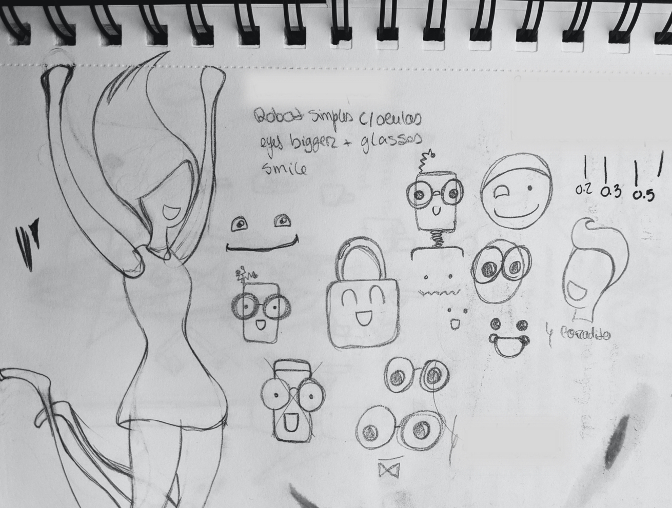
From the sketch book
Process
Name
We started by choosing a name. We felt strongly that the visual would work in favour of the name, and not the other way around. This because we wanted a name that would play to our brand’s advantage like, for example, a self-descriptive name or a name that contain keywords.
Doccle being an administration platform we wanted names going towards documentation and paperwork. We did a brainstorm with the entire company, which at the time was quite easy since we were like 12 or 15 people in total. And everyone had a week to think about names and explain where their inspiration came from and why they felt that name would be good for our chatbot. We set down with all the feedback and from the joining of two or three names we came up with “Doccy”, a reference to DOCuments and of course DOCCle.
To see if it would work we started to use it in conversions, for example:
Person 1: So Vera, how’s the chatbot thing going?
Vera: Doccy is going great, it almost has an avatar!
Or
Person 2: Hey Giel, is the chatbot ready to start answering questions?
Giel: Doccy is still learning.
This helped us to understand peoples’ reactions better than just “Hey everyone, our chatbot will be named Doccy” With the approach of switching “chatbot” to “Doccy” in conversations helped it to immediately grow on people, like if it was going to be our next colleague to join the team.
Creating a persona
As previously stated we wanted to be clear that on the other side was a bot and not a person. But we also wanted to give some humanistic visual cues to the avatar so that people could connect with it.
For us, the visual cues were glasses. We believe that when someone or something has all the answers it was to wear glasses. Right? 🤓
Adding the glasses, or other human characteristics, helps the chatbot to be more relevant and also provides a fun experience to the human on the other side of the conversation.
It’s human behaviour to project human traits onto almost everything, “thinking of a nonhuman entity in human ways renders it worthy of moral care and consideration”. This is called anthropomorphize.
During the sketches phase, we had all kinds of debates.
Should the chatbot have a gender? - No
Should it be an “it”? - Yes
Should it be a document with glasses? - not engaging enough
Should we give arms to the document? You know, to make it more human. - Naaaaaah
Should it just be a blob of colour? Not looking like anything at all. A blob of colour with glasses! - Zero engagement from people...
So, when a happy robot wearing glasses appeared on the sketches we immediately felt that that was it. We had our avatar. It had enough human traces, is an ‘it’ and has some mystery to it like “why would a robot need glasses?” - “The price of knowledge?” 🤷♀️(We really can’t help but anthropomorphize...)
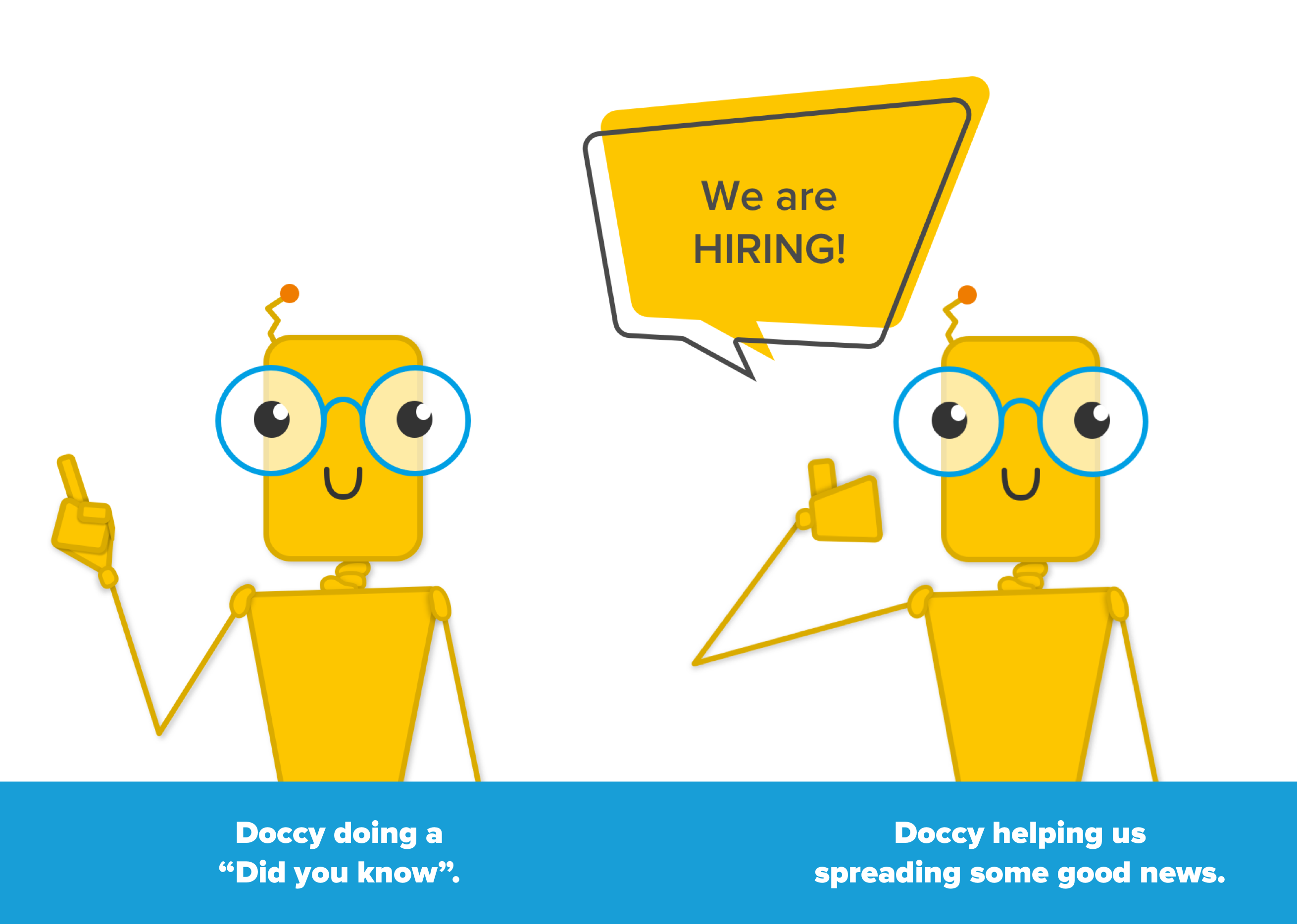
Some Doccy usage throughout the platforms or Social channels
Applications
Using the Persona Method helped us to develop the character of the avatar and use it throughout our product.
Social media assets and advertisement are great ways to give it more life and increase our brand recognition.
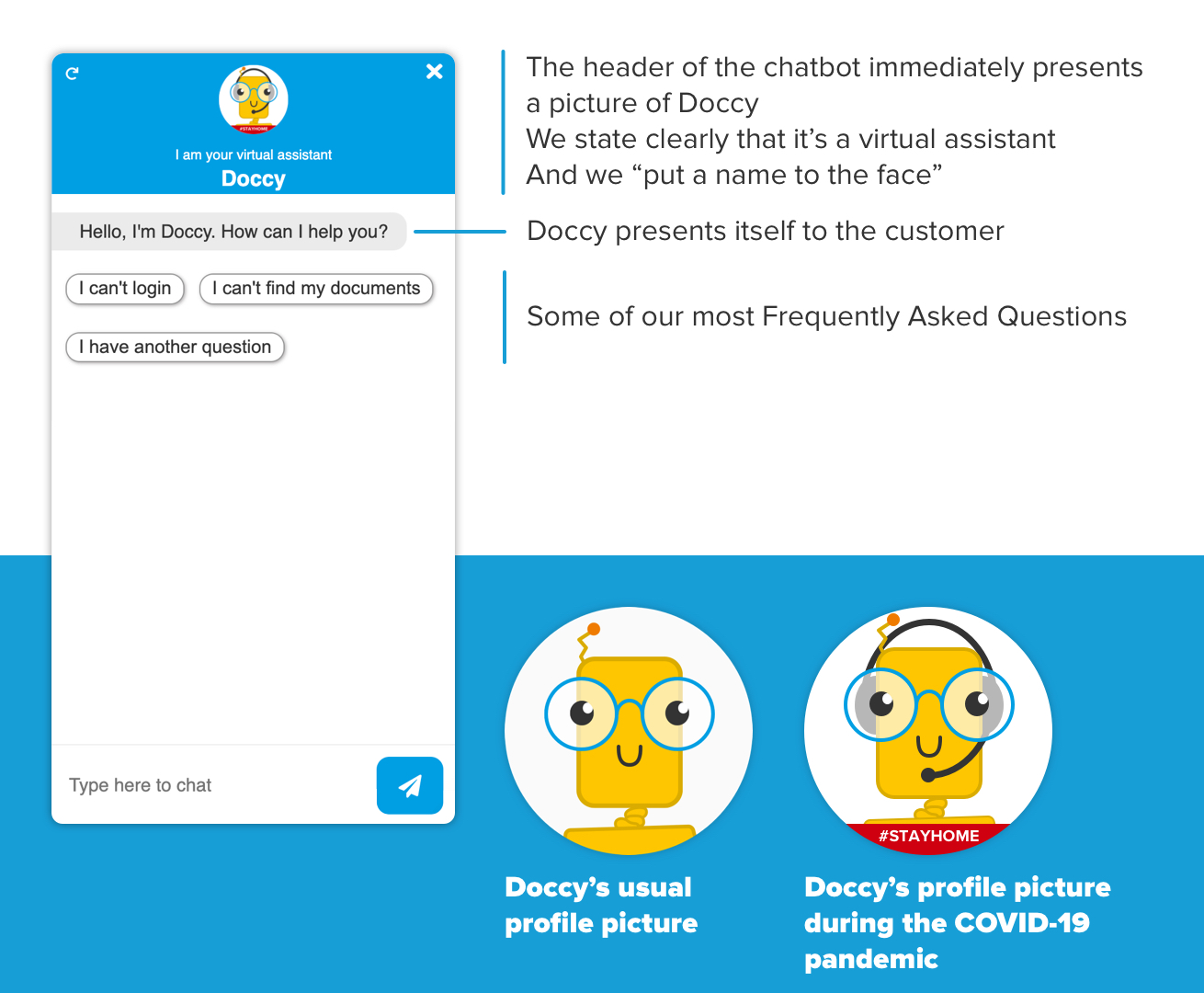
end result
You can now find Doccy on our website, giving you all the updates on our platform.
You can also find him on social media, keeping you up to date with the latest about Doccle.
On our team’s page, Doccy lets you know what drives it and some personal interest. Just like the rest of the team 😁!
Doccy will also celebrate the Belgium holidays with you, and you’ll even get to meet its parents!
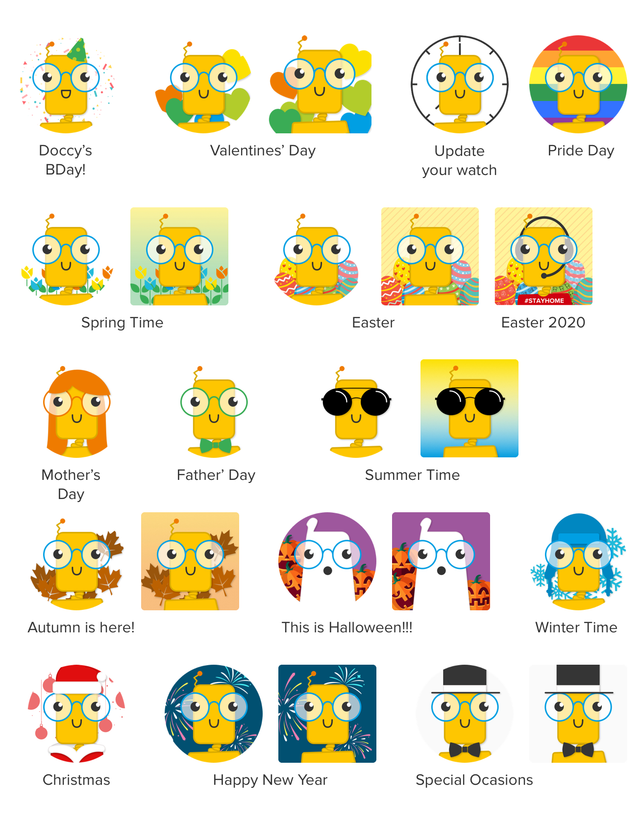
Round images are the profile pictures and the square versions are the ones used on Social Media channels
Outcomes & Lessons learned
When releasing Doccy to the public we found that announcing Doccy on our platform and social media some weeks in advance helped on its acceptance by the younger public. For the more conservative Docclers what helped was keeping the option to “send a ticket to a human” on the first line in the beginning. We slowly shifted down that option more and more until it’s no longer visible. But still possible depending on the type of question.
Doccy revelled itself by being a great ambassador for the Doccle brand. People engage more on social media posts where Doccy is part of the visuals. And on the product side, for example, when Doccy announces maintenance or technical issues our “angry” tickets are softer now and there’s a small decrease in amount.
Doccy was a really fun project to work on and I’m really happy with the results.
Extras
Read more about our dear Doccy on our blog.
I also wrote a Medium article about this, in case you're interested.
The article was also published in Spanish, on the publication Planeta Chatbot : todo sobre los Chat bots, Voice apps e Inteligencia Artificial.